Mowic
Brief
Brand – MOWIC
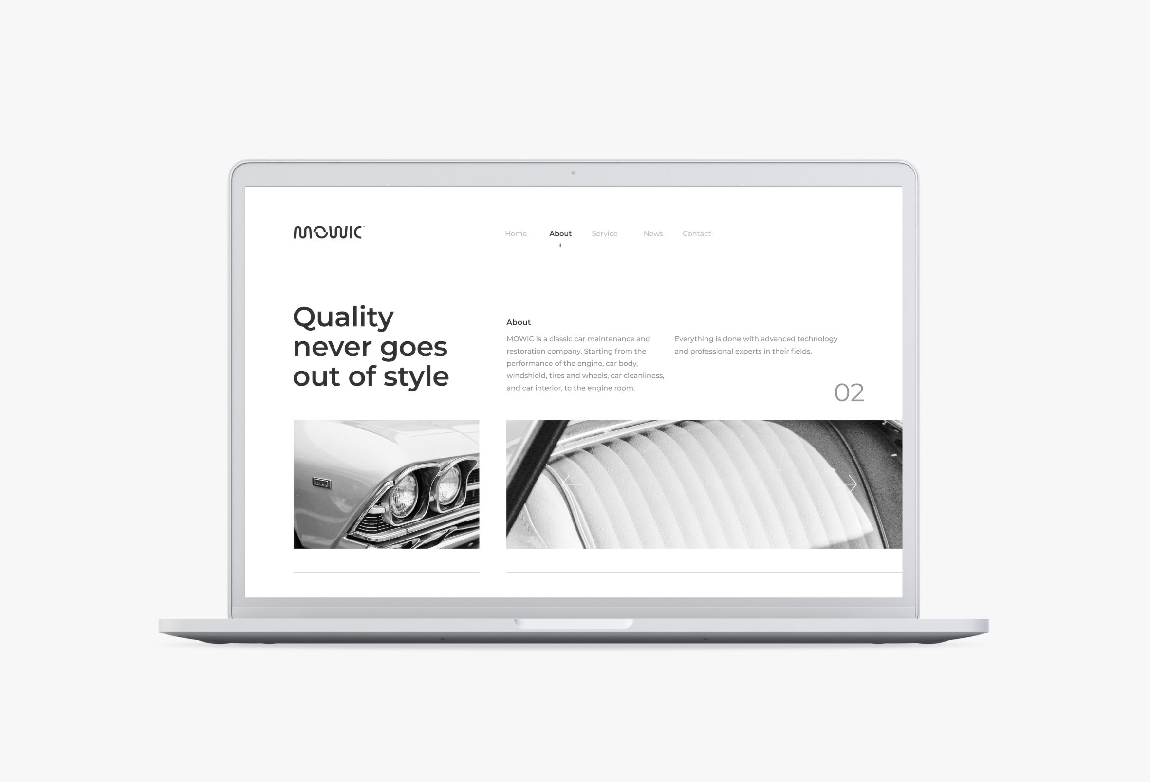
MOWIC is a classic car maintenance and restoration company. Starting from the performance of the engine, car body, windshield, tires and wheels, car cleanliness, and car interior, to the engine room. Everything is done with advanced technology and professional experts in their fields.
Market – 38 – 55 years old
Challenge
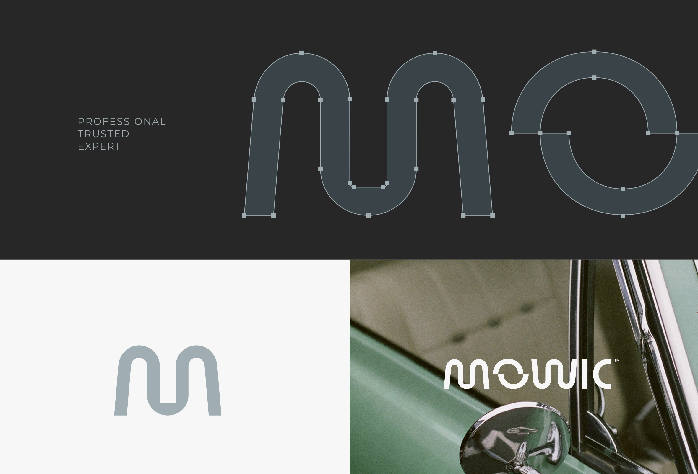
Create a simple and modern brand identity by exploring custom typefaces. Presents the symbolization of workshop equipment, services, caring, and trust in the form of a wordmark.
Concept
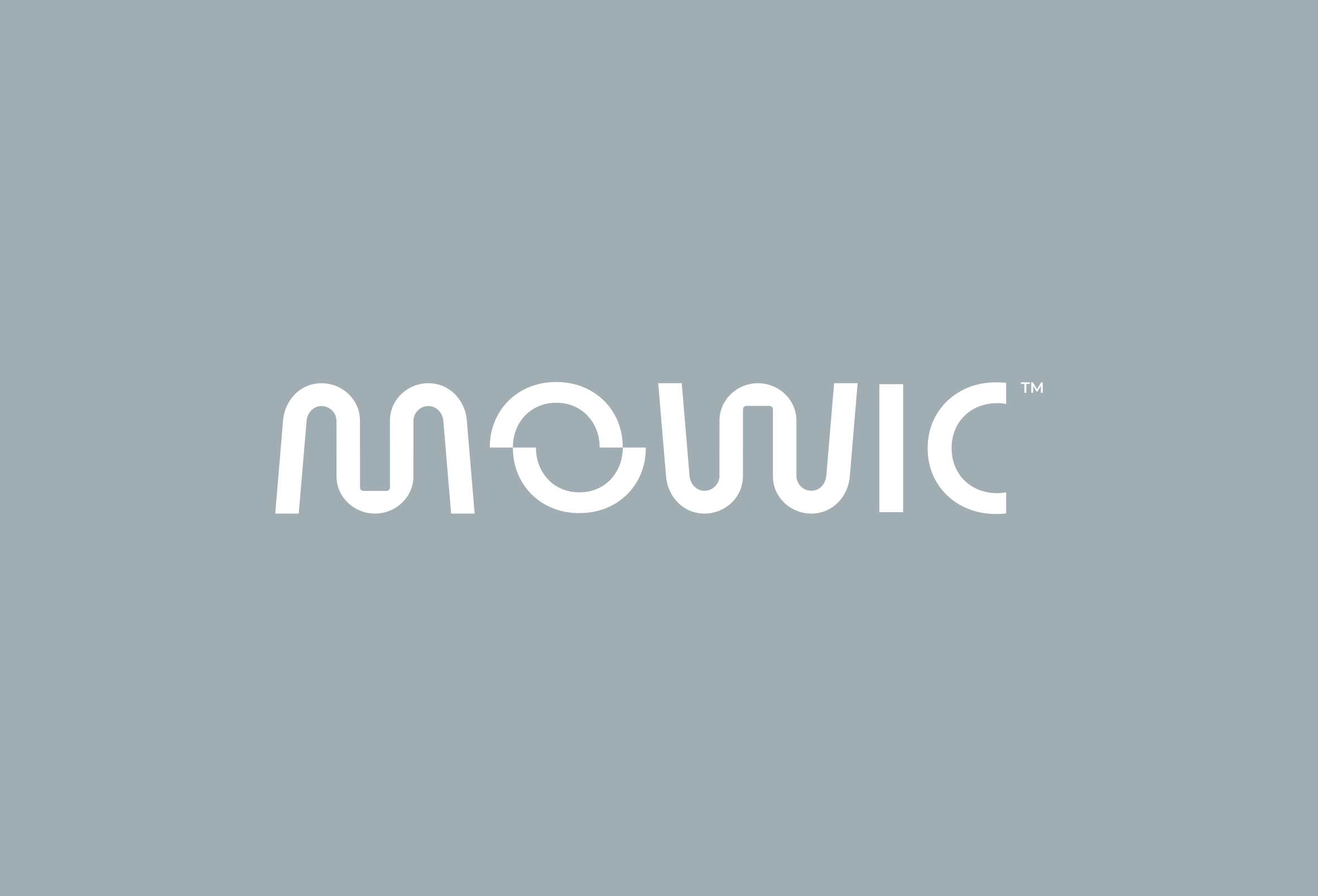
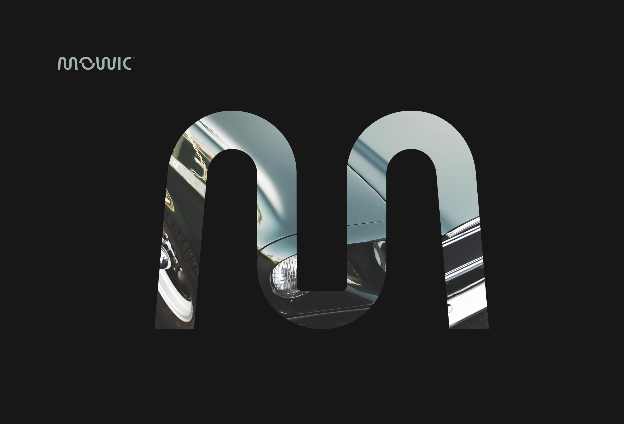
The concept of brand identity is an exploration of the use of special fonts as wordmark logos. With modern, cool, unique, and strong characters. Exploration of the main concepts in the MOW letter. The letters M and W, are symbols of the wrench shape. And the letter O is a symbol of the shape of the hand above and below. It represents service, caring, trust, and empathy. Because every moment counts, so do classic cars.
MOWIC / Brand Identity Design / 2022 / USA


